


Bentley Motors unveils new ‘Bentley Wings’ logo
The new ‘Winged B’ logo marks the fifth design evolution in the brand’s 106-year history and will be officially revealed alongside a new concept car on July 8, coinciding with the opening of Bentley Motors’ new design studio at its factory in Crewe, UK.
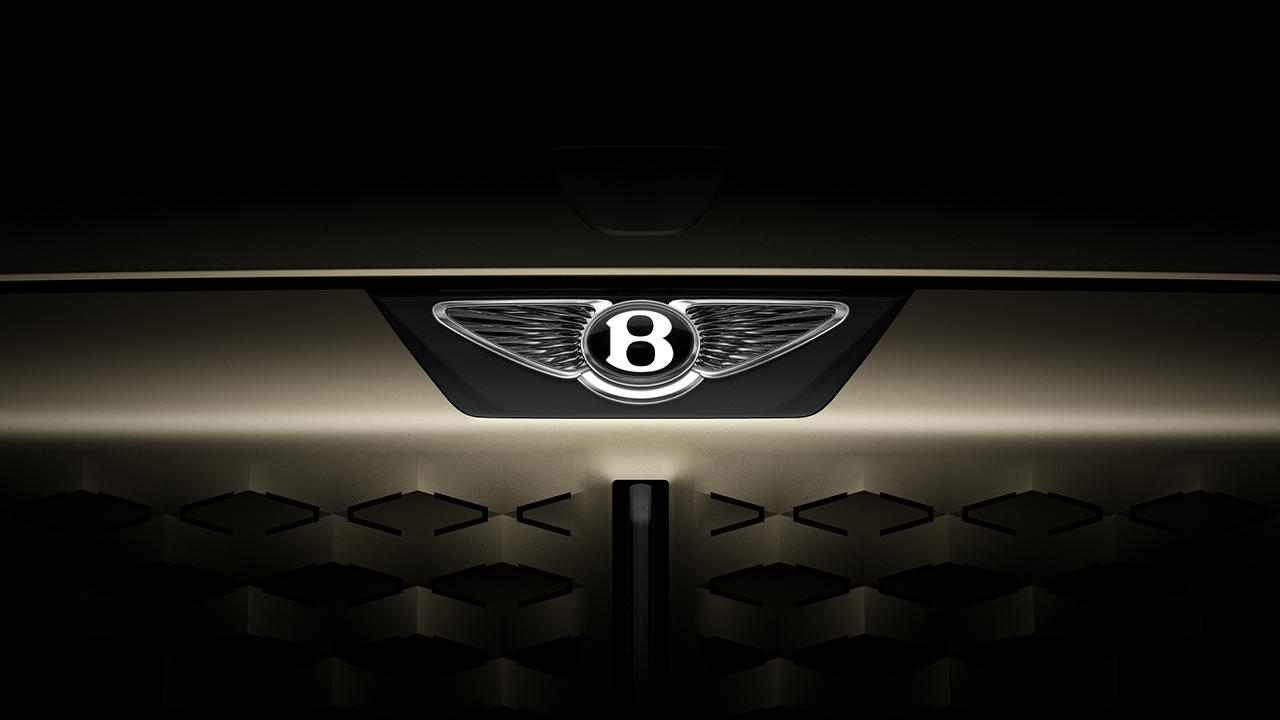
The original ‘Winged B’ logo was designed by F. Gordon Crosby in 1919 and has undergone revisions in 1931, 1990, and 2002. Now, in 2025, it receives its most significant transformation in over a century. The new design was created by Bentley’s design team under the close supervision of Robin Page, Director of Design. This new Winged B logo represents the first step towards Bentley’s future, crafted with intention, care, and creativity. It serves as a symbol of the exciting new chapter ahead for this iconic British carmaker. The new logo will debut officially with the upcoming concept car, which will introduce Bentley’s new design philosophy. Although the concept car, inspired by Bentley’s legendary models of the past, is not intended for production, it will signal the brand’s future direction. The concept is scheduled for its world premiere on July 8.
The story of the Winged B logo
The elements of Bentley’s brand logo have always maintained their unique identity: the prominent “B” letter at the center flanked by two wings. When W.O. Bentley founded the car company in 1919, he wanted a logo reflecting the pursuit of performance limits. He collaborated with F. Gordon Crosby, a renowned pre-war automotive illustrator who reimagined cross-continental racing for readers of The Autocar. Crosby designed the original Winged B, with Bentley’s “B” at the heart of a pair of wings chosen to evoke a sense of thrilling excitement — and to reference W.O. Bentley’s background as an aircraft engine designer during World War I. Crosby intentionally gave each wing a different number of feathers to make the logo distinctive and difficult to counterfeit.
When Bentley came under Rolls-Royce ownership in 1931, a new symmetrical logo was introduced, featuring 10 straight feathers on each side flanking a simple “B” in a black oval. This second version became the longest-used logo in Bentley’s history, remaining in place until a third redesign in the mid-1990s, which refined the central “B” to honor Crosby’s original design. The badge and wing curves were also emphasized for greater visual impact.
Following Volkswagen Group’s acquisition of Bentley in 1998, the logo was redesigned for the first-generation Continental GT, launched in 2002, marking Bentley’s new era. This period saw annual production rise from 1,000 to 10,000 cars. The new Winged B logo reintroduced an asymmetric design, with 10 feathers on the left wing and 11 on the right, as a tribute to the 1919 original. This version has been Bentley’s main logo ever since.

*Evolution of the Bentley logo from 1919 to 2025 (bottom to top)